Love in the Buff
Poster redesign for Hong Kong director Pang Ho-Cheung
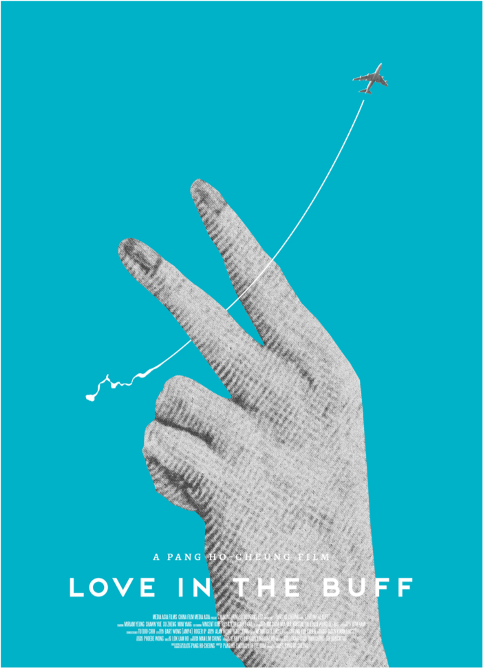
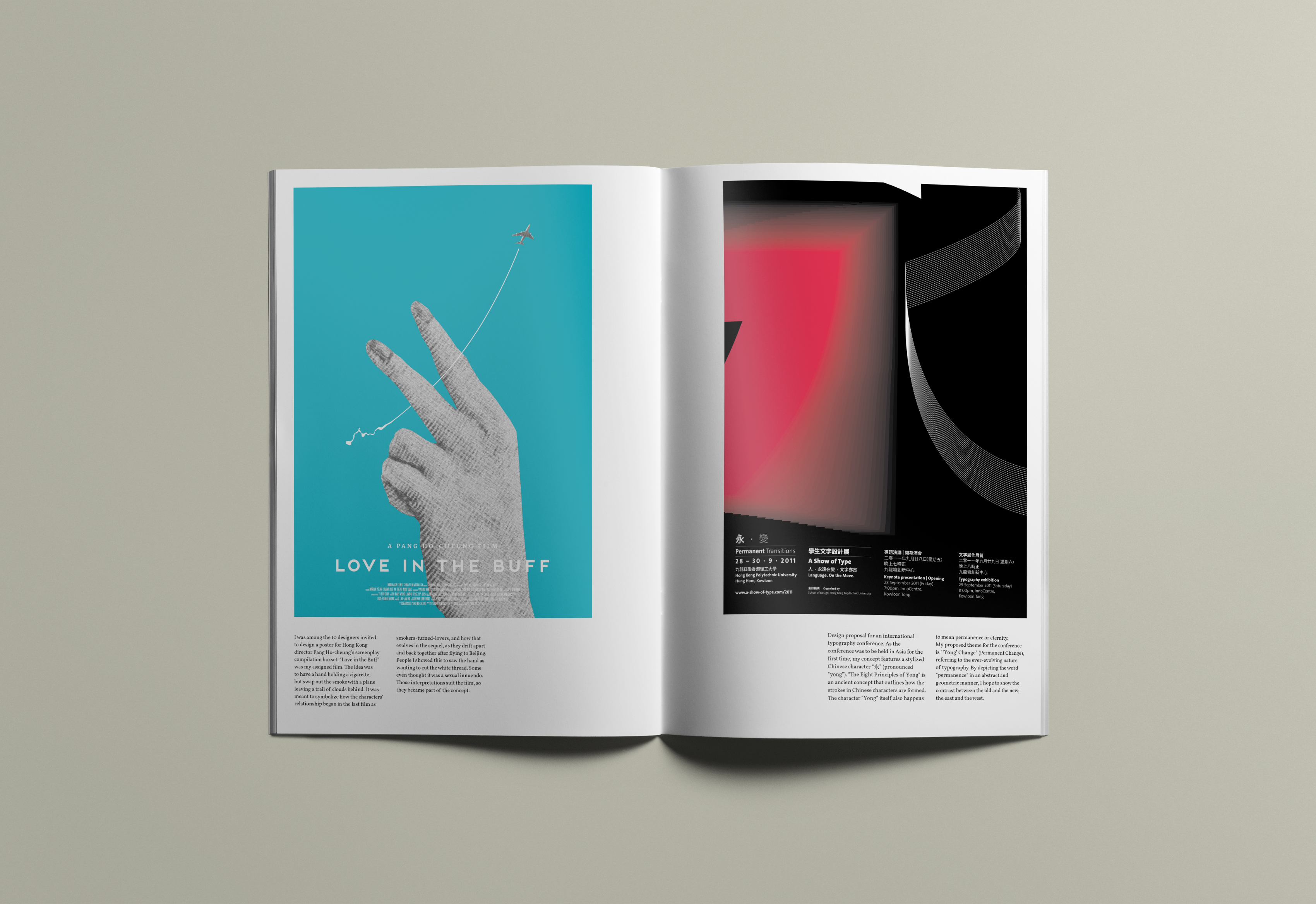
I was among the 10 designers invited to create a poster for Hong Kong director Pang Ho-cheung’s screenplay compilation boxset. “Love in the Buff” was my assigned film.
The idea was to have a hand holding a cigarette, but swap out the smoke with a plane leaving a trail of clouds behind. It was meant to symbolize how the characters’ relationship began in the last film as smokers-turned-lovers, and how that evolves in the sequel, as they drift apart and back together after flying to Beijing. People I showed this to saw the hand as wanting to cut the white thread. Some even thought it was a sexual innuendo. Those interpretations suit the film, so they became part of the concept.

Jon Sequitur
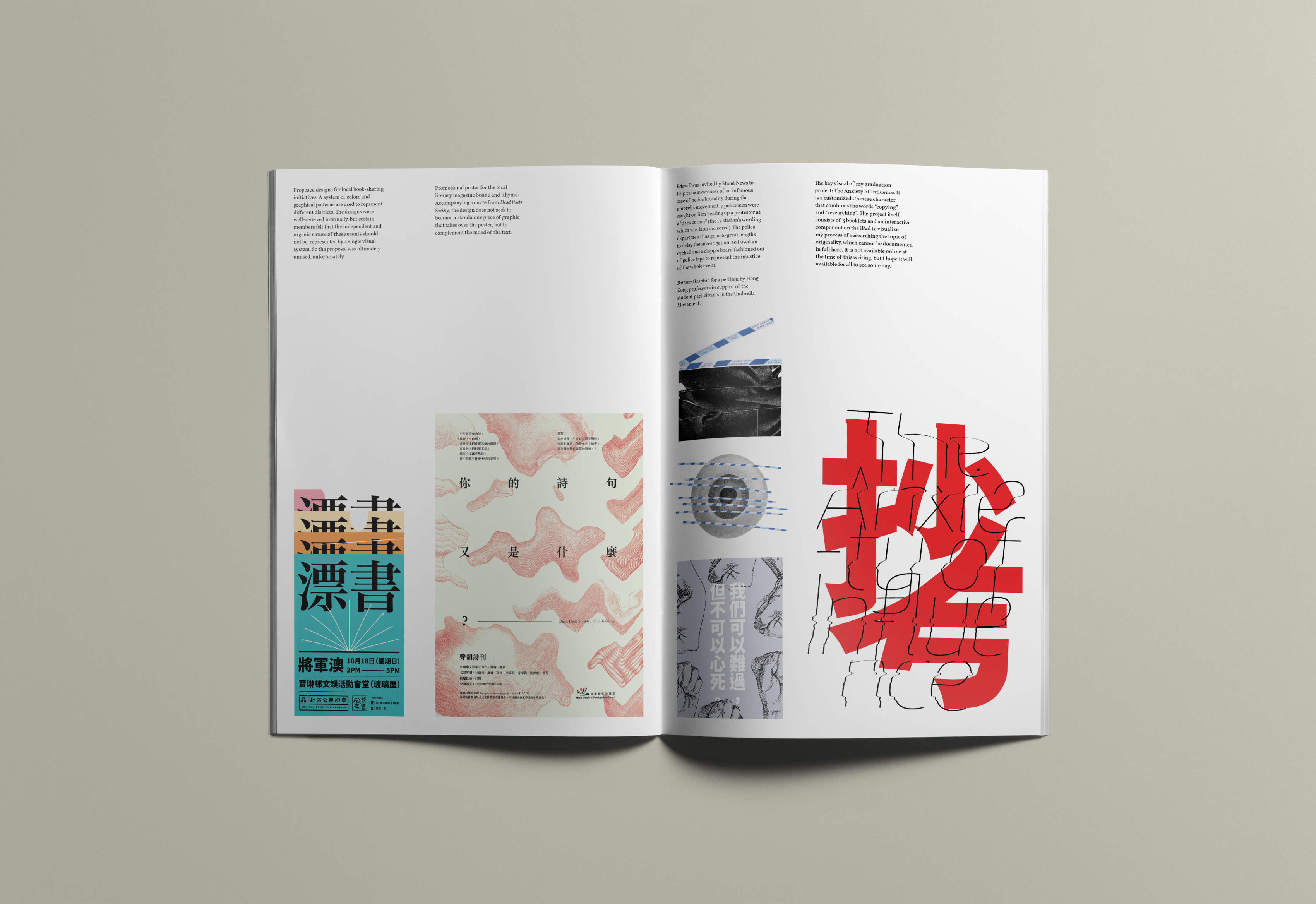
我的「個人展覽」現正在母校舉行。(主題解釋在最後兩段)Did not expect my first "solo exhibition" to happen at my alma mater.
其實三月已經開始,今天再回校 sharing 才有時間拍照記錄。但學校保安嚴密,校友走進校門都被 security 很不客氣地審問,所以外人基本上無可能入內參觀,抱歉。
(大大的頭盔:之前天氣突然非常潮濕,令紙張皺起來和有點發霉。我係 proud of my work,但沒有時間/budget把作品裱好,今天搶救它們後還是效果麻麻。請不要為了恥笑我而強行進入。)
素來以有自知之明為榮(可能這才是終極沒有自知之明 but anyway),覺得過往經歷尚算值得分享,所以之前有回校演講,但把作品放在 gallery 讓我挺猶疑。認真學習和做設計只有五年,難道要搞一個「回顧展」?未夠班之餘,亦很怕為展覽強加一些牽強的主題或信息。
最後還是接受了。上一次展覽是眾多建築師校友的作品集,渺小的 graphic design 難得可以放在同學每天會經過的地方,希望讓有興趣的師弟妹日後投身這一行。
另一個理由比較自私:一個年輕設計師,無論說還在尋找一種風格,還是說不想讓自己被一個方向限死也是太普遍的話題,所以我也不說了。實質的問題就是,看著自己過往的所有作品作為一個整體,沒有一種自自然然地舒服好看的感覺。部分設計是挺滿意的,但放在一起就是有點問題。
所以,決定擺 exhibition,就是想硬著頭皮逼自己整理 portfolio。處理實體空間的能力很弱,希望自己做白老鼠,累積多點展覽設計的經驗。
主題來自拉丁文 non sequitur,意思是和前文後理無關係,不合邏輯的推論。小時候看到這個字覺得很有趣而記住了。變成 "Jon Sequitur" ,意思就是:你看到的是一些亂亂的,有點隨意和(希望是)有趣的東西,亦就是屬於我的東西。
因為不喜歡一般展覽很造作的 "theme",倒不如承認自己的整理背後沒有什麼章法,只是覺得放得好看而已。亦正因如此,我的介紹特別說明這只是一些讓人感到有趣的 eye candy,希望沒有誤人子弟,扭曲他們對設計的理解...
